BookMD App Feature Expansion
UX Design
Client:
BookMD
ROLE:
UX Lead
DURATION:
3 Months
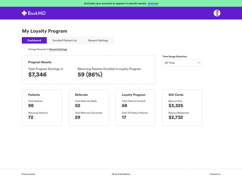
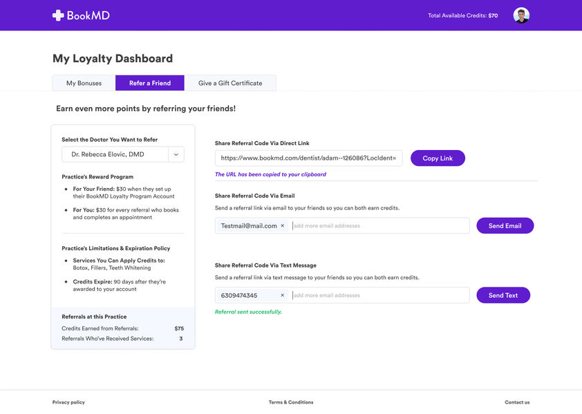
This project consisted of a series of feature adds to an existing web product for medical doctors that digitized all aspects of their typical administrative work. At the outset, the scope was to design a loyalty program-building experience for doctors offering cosmetic procedures. Due to the client's satisfaction of the initial delivery, the scope was expanded to including designed experiences for doctor-to-doctor networking with a set of features that mimic those of mainstream social media platforms.
Goals
Phase 1: Give doctor users a way to launch and manage a loyalty program for their services inside BookMD.
Phase 2: Allow doctor users to use BookMD as a social networking platform to meet other doctors and refer them to patients.
In addition to these feature additions, it was important that the design maintained standards to fulfill HIPAA requirements given the app's use in the medical industry.
Users
Who uses this tool and for what main purposes?

Doctor: I am a doctor with my own practice. In addition to caring for my patients, I want to scale my business, create efficiencies for admin work and function within an organized system that allows me to review patient records easily, all while complying with HIPAA laws.

Office Admin: I am the office manager or front-desk receptionist for my doctor's practice. I want to keep my doctor's schedule in order and manage his or her affairs within an easy, organized system. I should not see sensitive information about patients.

Patient: I am a tech-savvy patient that is looking for a specialist on the web. I want a tool that allows me to quickly find a doctor according to my needed parameters (insurance, location, specialty, quality, etc.) all in one place. After visiting a doctor using BookMD, I want an intuitive experience to review follow-ups from my doctor, communicate with him or her for future concerns and to pay any outstanding bills.
Competitive Analysis
What's out there already?
Loyalty Program Features
To get a baseline sense of user expectations for a loyalty program management tool, we examined top-performing apps available on the market with the same feature set and, in some cases, the same target audience (doctors and med spas).
RepeatMD
Feature Review:
Provides patient users a way to pay in installments
Allows patient users to register via a scan code in-office
Doctor users can set their own logo to be the app thumbnail image
Doesn't use dollars or credits, loyalty members are rewarded with products or services in whole
Easy path to refer friends to a service via text
Design Review:
Allows users to incorporate many visuals
Modern, minimalist design
Visuals used correspond to actions
Progress bar utilized with Rewards Tracker
Allē
Feature Review:
Some customers complained that their points expired without warning; good to have an automated email to remind patient users about upcoming expirations
Uses a point system
Includes gift card gifting ability
Design Review:
Color scheme and typography style follows common trends in beauty
Generally uses a sleek appearance, but less appealing imagery compared to RepeatMD
ReferralMD
Feature Review:
Allows users to text message patients from the app
Robust documentation regarding a patient's visit
Appears to be more similar to BookMD given the suite of admin features available; not just a tool for building a loyalty program
Design Review:
Appearance feels reminiscent of LinkedIn between colors, layout and block treatments
More text used than icons, although icons and thumbnails are still present
Social Networking Features
Sermo

Feature Review:
Main use is to connect doctor users with each other to stay on top of medical trends; no tools for scheduling patients
Some similarities to Reddit, allowing users to follow particular topics
Includes a drug rating feature
Includes a survey feature
Design Review:
Brand is very similar to BookMD's-- purple used for primary, teal as accent
Clean, organized appearance
Icons accompany most action labels
Some similar UI elements to Facebook with use of white floating blocks on a gray background
Doximity
Feature Review:
Most appreciated feature from its users appears to be phone number masking, allowing doctors to tie their office numbers to their personal phones
Serves articles to the users which, when read, awards them CME (Continuing Medical Education) credits
Primarily a mobile experience
Design Review:
Very clean and minimal; brand colors are kept to a minimum
Use of familiar iconography
Format resembles other popular social media sites for commenting and engaging with articles
Feature Review:
When creating a group, user can add industry tags
Ability to require admin review of new posts to a group the user has created
Design Review:
Groups are not prominently featured in the main nav, instead housed within the "My Network" tab
Blend of rounded and sharp edges for buttons-- not necessarily a positive, but interesting to note
Ellipsis used to provide more action options to the user on a post or list item
New Feature Roadmap
What do we need to work on first?
To get ourselves organized, we began the project by writing out stories for each feature set, categorizing them by priority and user. We understood that most doctor users were running their own practices, and therefore motivated towards growing their business. Given the revenue implications of a loyalty program, it made sense to prioritize this work over nice-to-have's such as a social networking experience.
New Feature Flows


DESIGNS
The length of the design process is always variable, depending on the needs of the customer. In most cases, I strive to iterate off of real user feedback, setting up moderated or unmoderated tasks to test partial prototypes for usability and comprehension.
BEFORE/AFTERS
PROTOTYPES
At the prototyping stage, I'm working closely with devs to ensure that expected behavior isn't only shown through the design, but annotated and documented for their reference as they bring the design to life.


