
Global Navigation Redesign
UX Design
Client:
McGraw Hill
ROLE:
UX Manager
DURATION:
6 Months
A redesign of an global EdTech company's website navigation to reduce visual competition and improve findability, with implications on organizational structure.
Background
How can a global education company improve its navigation for users?
McGraw Hill is a global education company with offerings spanning multiple business units and target markets. Its website fields traffic from +8 million users a year. Users rely on the site to find products, locate support resources and make purchase decisions, making the redesign of the nav bar a key project to improve the content structure of the site.
GOAL
Create a clean, accessible navigation interface that intuitively guides users to data-driven, persona-based paths to achieve known website tasks.
Reduce navigation bar's visual competition with the page content without impacting findability of key nav interactions (on some pages, the nav bar had up to 4 layers and a height of as much as 275px)
Improve content structure to align with user engagement trends, jargon and expectations
Ensure that the navigation bar is fully compliant with WCAG 2.0 web accessibiltiy standards
USER STORIES& ANALYTICS
Who will use this and what do they need to do?
User | Intent |
As an educator… | I want to easily navigate to relevant offerings by identifying the learning level and subject matter for the classes that I teach, so that I can purchase items for my K12 class. |
| I want to easily navigate to relevant offerings by identifying the learning level and subject matter for the classes that I teach, so that I can adopt them for my Higher Ed class. |
| I want to an easy way to launch products I’m using to teach my classes, so that I don’t have to hunt for the sign in page. |
As a student… | I want to easily launch products I’m using to learn in my classes, so that I don’t have to hunt for the sign in page. |
| I want an easy way to access my cart, so that I can quickly make a purchase. |
As a general visitor… | I want an easy and always-present way to search the site, so that I can quickly find whatever I’m looking for, regardless of the content type. |
| I want a clear way to sign in when I’m signed out, so that I can access my information and products. |
| I want a clear route to My Account when I’m signed in, so that I can find information related to my needs. |
| I want to know the region that my site experience is tailored to and the ability to change it, so that I can review offers that are available to me based on where I'm located. |
I want to have the right expectations of nav itmes so that I can get to the pages I need to complete the task I came to the site for. |
These stories were supported by:
Engagement trends via analytics tracking
Responses from website surveys
Compiled persona research and sales team insights
COMPETITIVE ANALYSIS & USABILITY TESTING
What other complex websites demonstrate a user-friendly approach to their website's navigation?
We began our effort with an analysis of other websites with digital and physical eCommerce offers for a variety of personas, including those in the education space. This would give us a heuristic-based foundation to the redesign. This step was a collaborative effort with our team's UX Researcher.
Initial Heuristics Comparison

Known Issues in Current Experience

Inefficient use of space (Learning level options take up the most space even though they largely would only need to be interacted with once)
Visual competition of general navigation options (dark gray bar) and microsite navigation, creating confusion (trends of users interacting with the dark gray bar expecting content to be related to the microsite topic)
Accessibility issues with atomic components used in the navigation (tabbing order, appropriate use of components, etc.)
Vague terminology, e.g. "Discover" and "Connect" (which is also the name of a McGraw Hill product)
RESEARCH
Our research approach was designed to capture a range of insights, from broad user reactions to different experiences down to detailed, specific decisions related to proposed new designs. We divided the work into (3) distinct phases.
Research Phase 1: Heuristics Comparison
Research Phase 2: Card Sorting & Tree Testing
This phase focused on McGraw Hill’s "Professional" business unit, which serves medical students and graduate-level studies. Recognizing overlaps with the Higher Education business unit, our research aimed to understand how users naturally grouped offerings. These insights allowed us to refine categorizations and improve groupings within the website’s navigation, creating a more intuitive experience aligned with these personas' expectations.
Research Phase 3: New Design User Testing
At this phase, initial designs have been created by leveraging insights from prior research and analytics. Collaboration with development and accessibility teams is essential to ensure the experience is both feasible and compliant, minimizing the need for major revisions after research efforts.
DESIGN
After insights are collected and a clear direction is set with agreement from stakeholders, designs are refined for dev handoff. At this step, I consult technical counterparts to ensure that the final design file is organized to correspond with the anticipated development work breakdown.
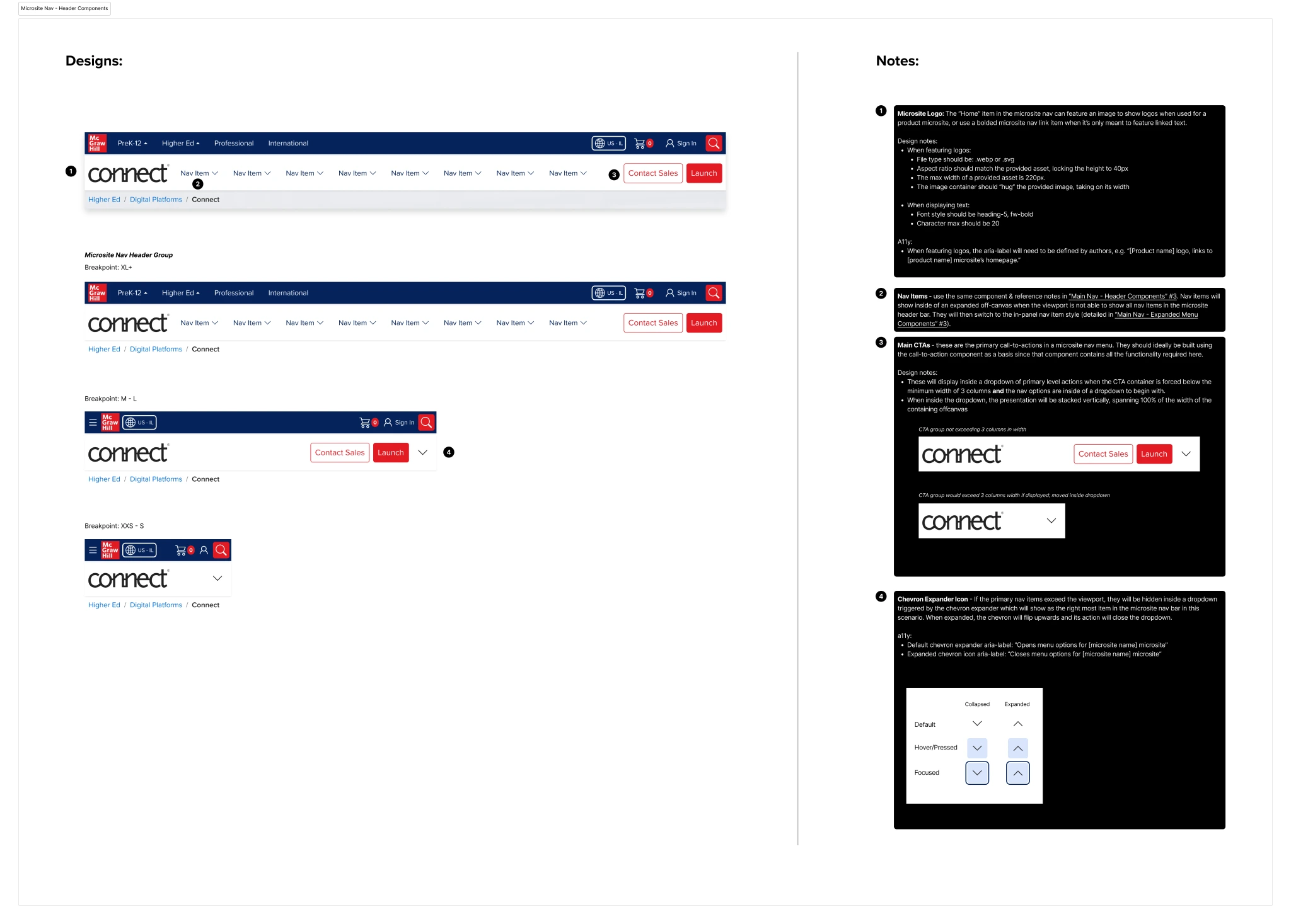

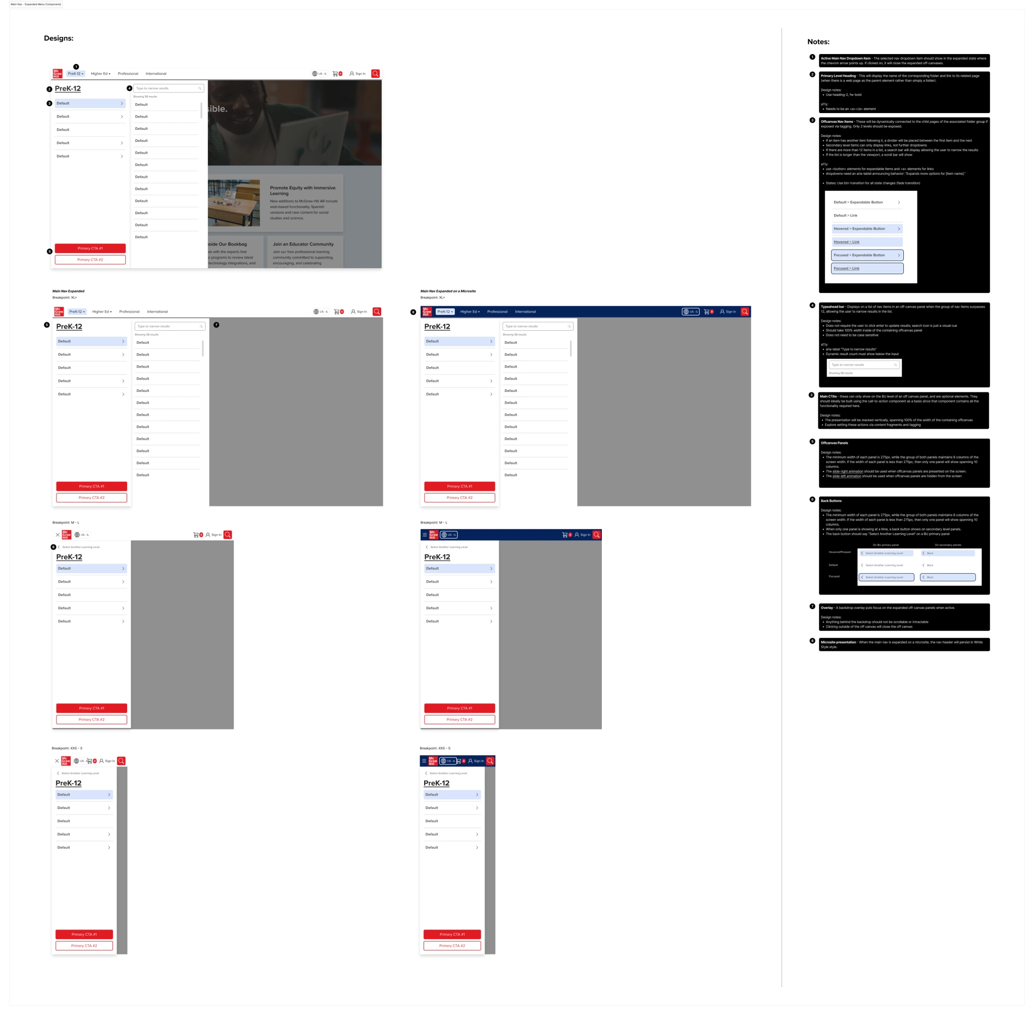
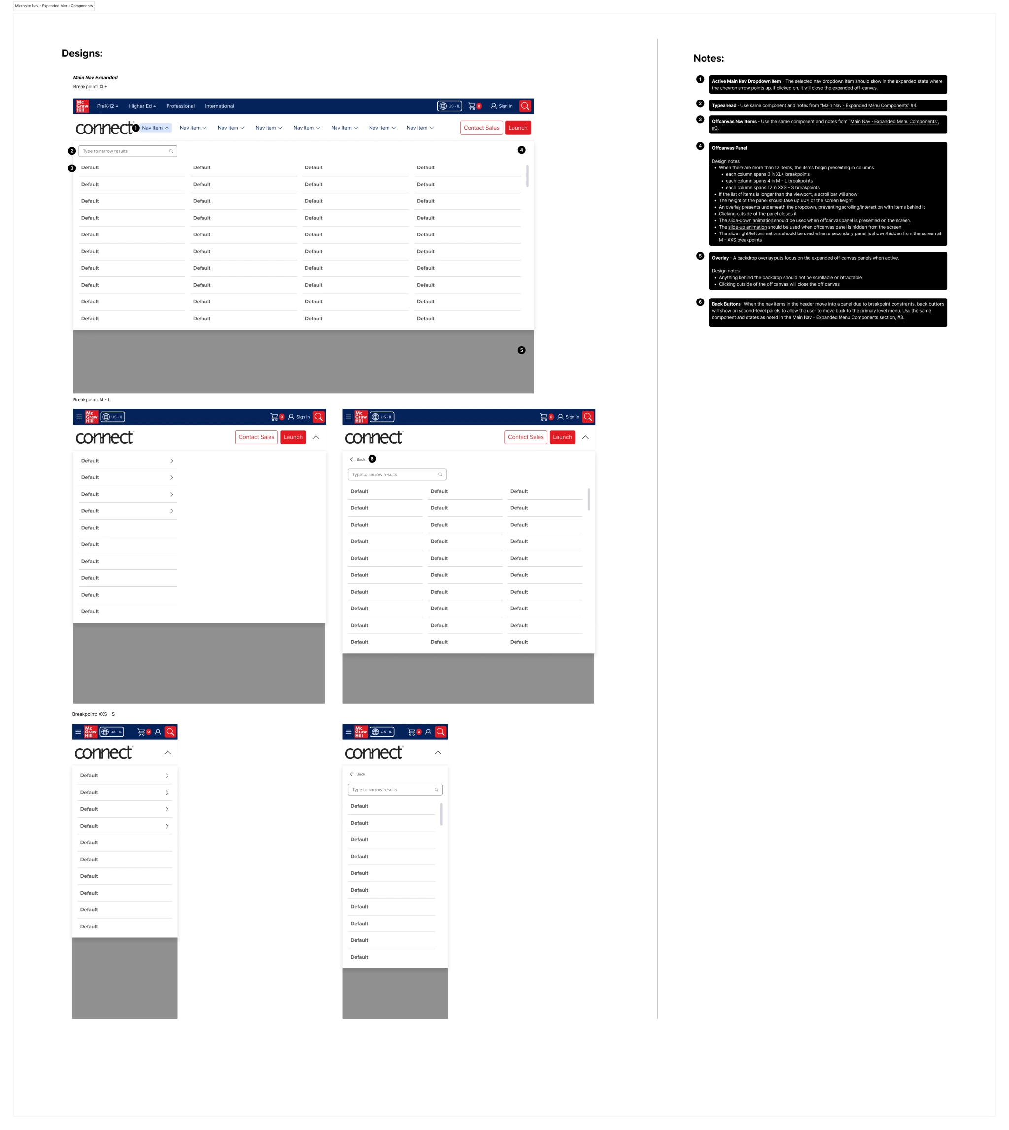
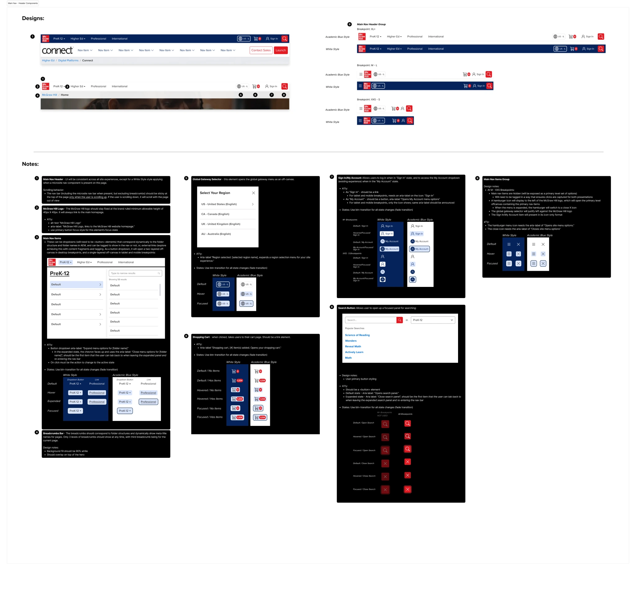
DESIGNS
The length of the design process is always variable, depending on the needs of the customer. In most cases, I strive to iterate off of real user feedback, setting up moderated or unmoderated tasks to test partial prototypes for usability and comprehension.
BEFORE/AFTERS


PROTOTYPES
At the prototyping stage, I'm working closely with devs to ensure that expected behavior isn't only shown through the design, but annotated and documented for their reference as they bring the design to life.